1. Customer Age Distribution
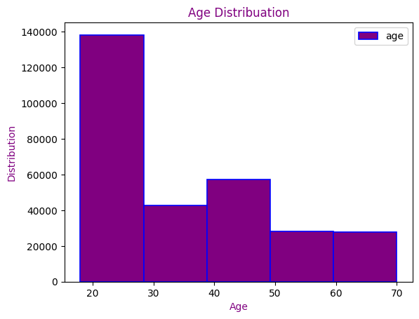
Shows age distribution to identify key shopper demographics.
Python Code
import seaborn as sns
plt.figure(figsize=(8,5))
sns.histplot(df['Age'], bins=12, kde=True)
plt.title('Customer Age Distribution')
plt.show()2. Sales by Product Category
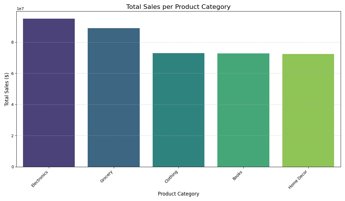
Visualizes which product categories contribute most to sales.
Python Code
import seaborn as sns
plt.figure(figsize=(9,5))
sns.barplot(x='Category', y='Total_Sales', data=df)
plt.title('Total Sales by Product Category')
plt.xticks(rotation=45)
plt.show()3. Total Purchases by Month
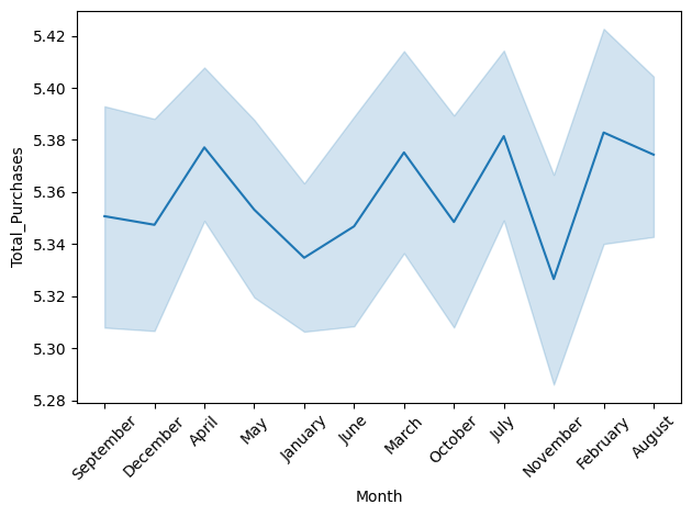
Tracks purchases over months to highlight seasonal patterns.
Python Code
sns.lineplot(data=df, x='Month', y='Total_Purchases')
plt.title('Monthly Purchase Trends')
plt.xticks(rotation=45)
plt.show()4. Payment Method Distribution
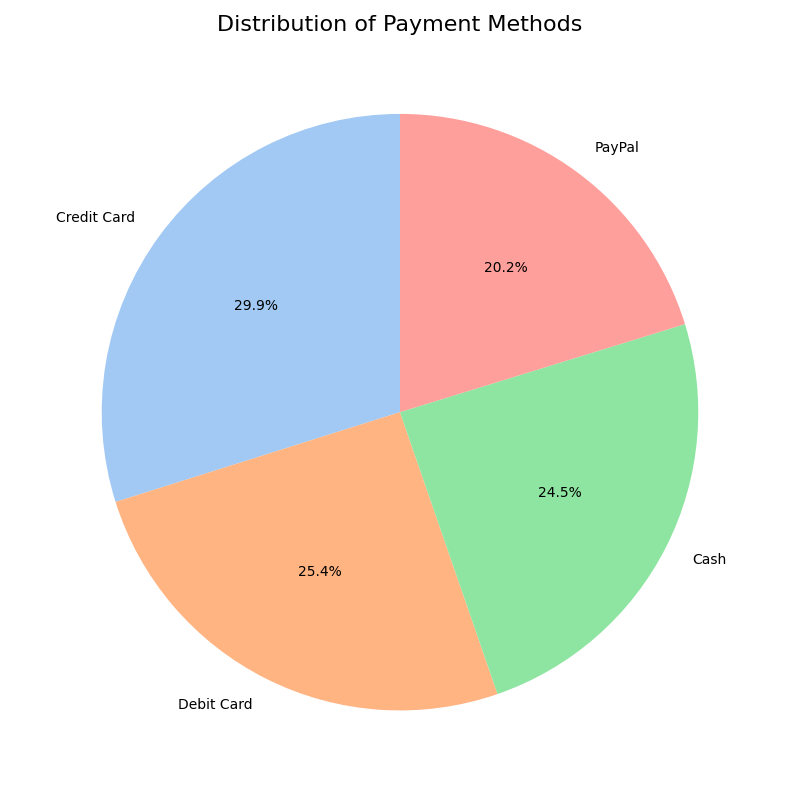
Displays the share of each payment method used by customers.
Python Code
counts = df['Payment_Method'].value_counts()
plt.figure(figsize=(8, 8))
plt.pie(counts, labels=counts.index, autopct='%1.1f%%')
plt.title('Distribution of Payment Methods')
plt.show()5. Spending by Customer Segment
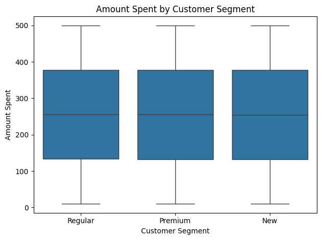
Compares spending behavior across different customer segments.
Python Code
sns.boxplot(data=df, x='Customer_Segment', y='Amount')
plt.title('Amount Spent by Customer Segment')
plt.show()6. Sales by City & Gender
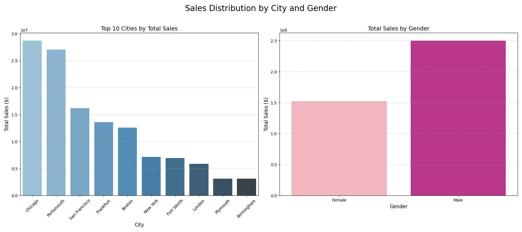
Side-by-side charts showing city and gender-based sales.
Python Code
# Left: Top Cities
sales_by_city = df.groupby('City')['Total_Amount'].sum()
sns.barplot(x=sales_by_city.index, y=sales_by_city.values)

# Right: By Gender
sales_by_gender = df.groupby('Gender')['Total_Amount'].sum()
sns.barplot(x=sales_by_gender.index, y=sales_by_gender.values)7. Correlation Matrix Heatmap
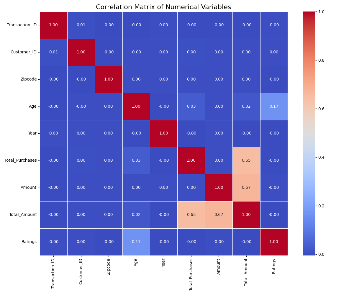
Reveals relationships among numerical variables.
Python Code
corr = df.corr()
plt.figure(figsize=(10, 8))
sns.heatmap(corr, annot=True, cmap='coolwarm')
plt.title('Correlation Matrix')
plt.show()8. Top 10 Customers by Spending
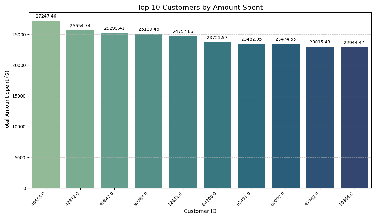
Highlights the highest-spending customers.
Python Code
top_customers = df.groupby('Customer_ID')['Total_Amount'].sum().nlargest(10)
sns.barplot(x=top_customers.index, y=top_customers.values)
plt.title('Top 10 Customers')
plt.show()9. Income Distribution (Violin Plot)
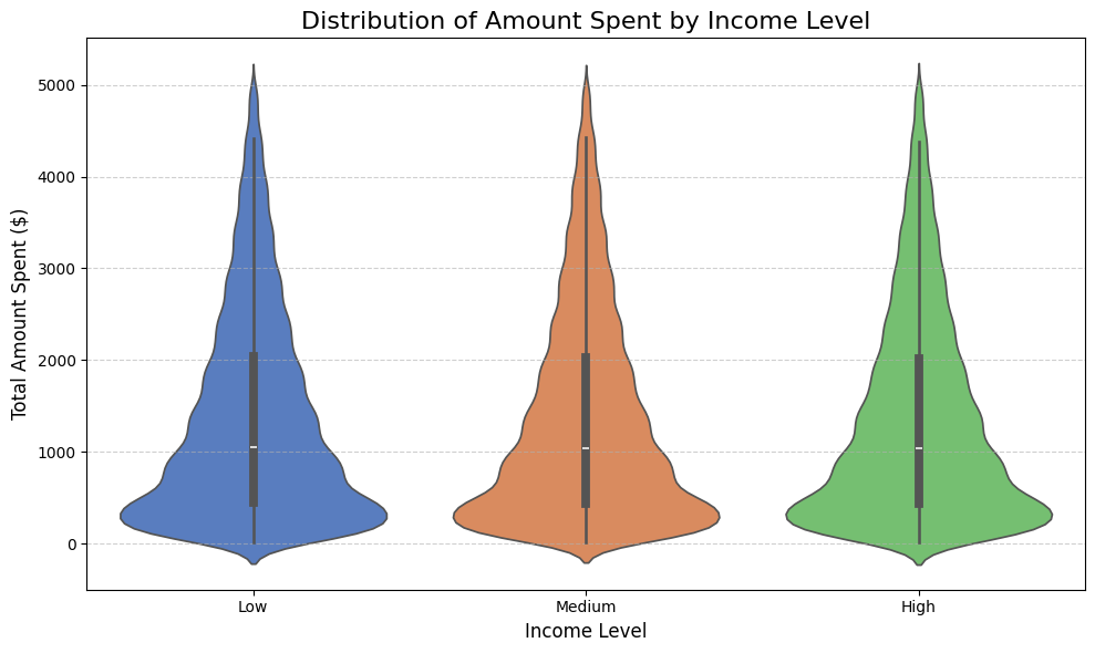
Shows spread of income with density and box components.
Python Code
sns.violinplot(x='Income', y='Total_Amount', data=df)
plt.title('Income Distribution')
plt.show()10. Cumulative Sales Over Time
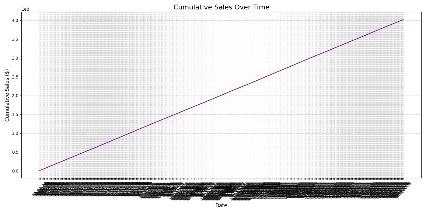
Tracks accumulated sales to measure growth.
Python Code
df_sorted = df.sort_values('Date')
df_sorted['Cumulative'] = df_sorted['Total_Amount'].cumsum()
sns.lineplot(data=df_sorted, x='Date', y='Cumulative')
plt.title('Cumulative Sales Over Time')
plt.show()11. Product Categories by Segment
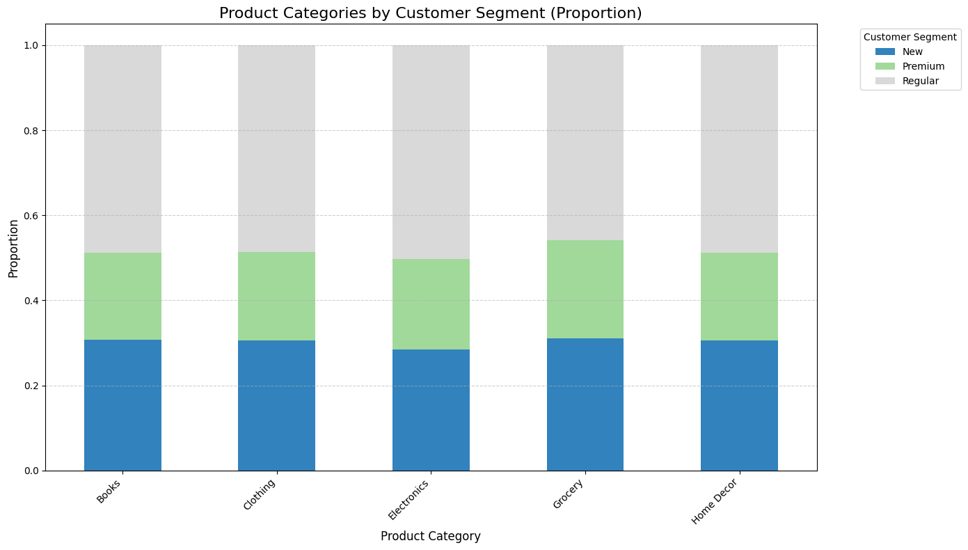
Shows product category preferences across segments.
Python Code
stacked = pd.crosstab(df['Product_Category'], df['Customer_Segment'])
stacked.div(stacked.sum(1), axis=0).plot(kind='bar', stacked=True)
plt.title('Product Categories by Segment')
plt.show()12. Density Plot of Spending
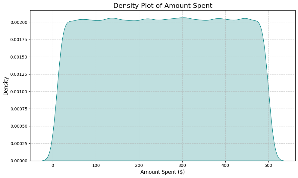
Shows overall distribution shape of spending behavior.
Python Code
sns.kdeplot(df['Amount'], fill=True, color='teal')
plt.title('Density Plot of Spending')
plt.show()13. Avg Purchases per Brand (Error Bars)
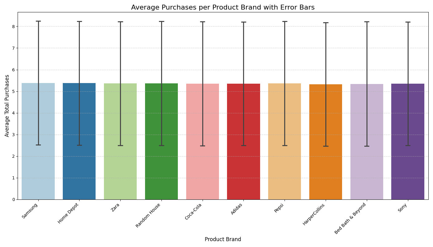
Shows variability of average purchases per brand.
Python Code
top_brands = df['Product_Brand'].value_counts().head(10).index
sns.barplot(x='Product_Brand', y='Total_Purchases', data=df[df['Product_Brand'].isin(top_brands)], ci='sd')
plt.title('Avg Purchases per Brand with Error Bars')
plt.show()